Cloverse Digital Screen
Responsive screen architecture and dark-mode design system
Our signature studio interface translated onto physical display devices, showcasing deep cyan canvases, lime clover marks, and high-legibility wordmark geometry.

Brand system carried onto screens: deep cyan canvas, lime mark, clean wordmark.
Strategic Objective
The Challenge & Goal
Showcase how the core Cloverse brand identity translates into responsive digital software interfaces with consistent contrast ratios and atmospheric glow treatments.
Creative Direction
Aesthetic Concept & Atmosphere
Minimalist, tech-forward, high-contrast dark mode with #6CDB1D clover lime functioning as the focal interactive anchor.
Execution
Design & Engineering Approach
We utilized strict 8pt spatial rhythm and calibrated typography weights to guarantee instant brand legibility across high-resolution displays.
Scope & Deliverables
What was crafted
- Desktop & Laptop Screen Mockup Guidelines
- Dark-Mode Interface Color Tokens
- Vector Wordmark & Mark Scale Standards
Visual Details
Asset Gallery & Application
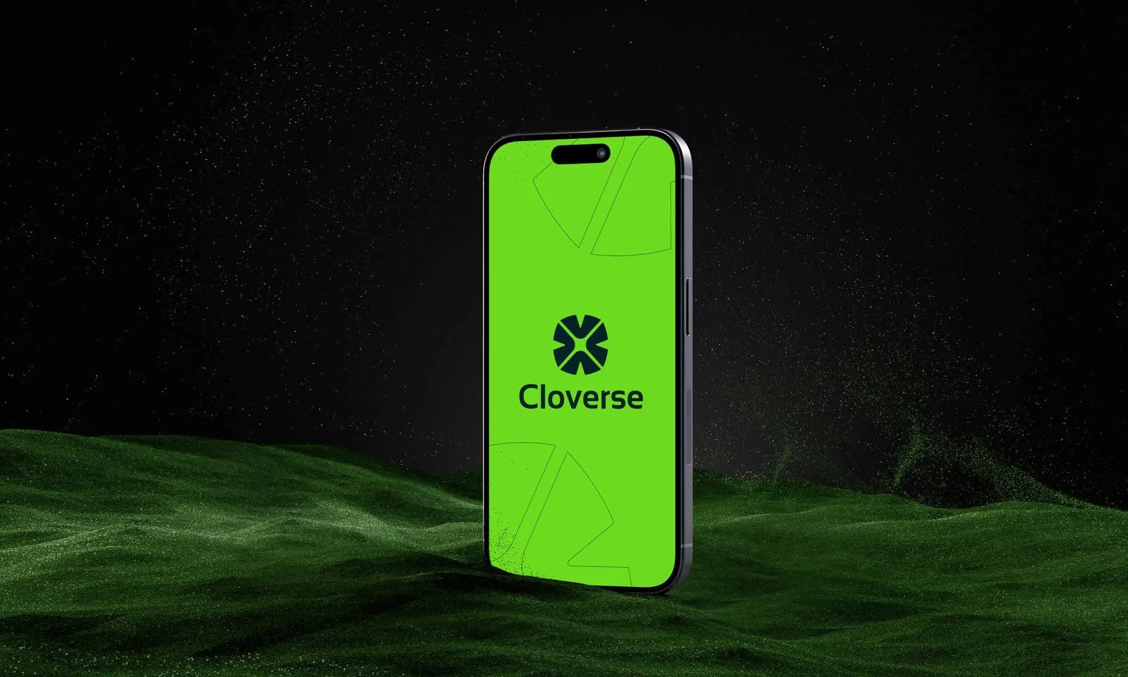
Seamless continuity between desktop displays and handheld devices.
Interested in similar craft?
Let's build your project together.
Every project is custom-designed and engineered to the highest standard. Connect with our team to discuss your goals and receive a clear proposal.